Inside 100 Years of the NBC Logo
Since its founding in 1926, the NBC logo has evolved alongside major moments in broadcast history – here's a look at every NBC logo change as the network celebrates its 100th anniversary.
May 04, 2026
As NBC marks 100 years as a broadcast network, the company reflects on a legacy of innovation and storytelling that has shaped both culture and technology, from the first coast-to-coast radio broadcast to decades of Olympic coverage, and from trusted news to iconic entertainment that has brought people together for generations.
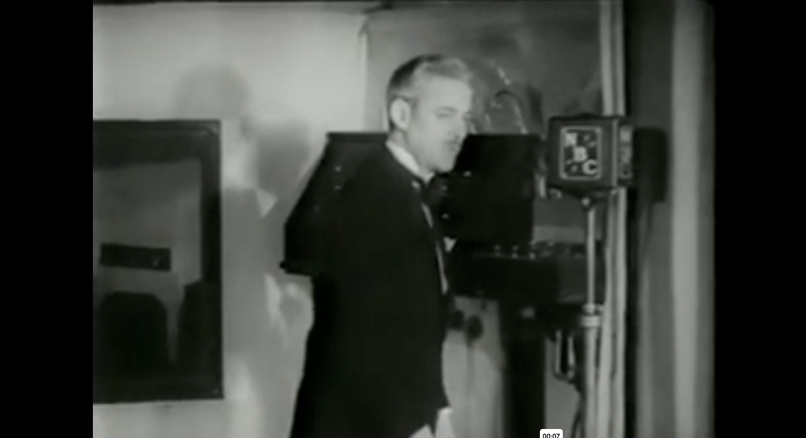
Pioneering opera broadcaster Milton Cross hosts the Metropolitan Opera, Dec. 25, 1931. The microphones display NBC's original logo.
Over the past century, NBC has evolved along with, and in many cases in advance of, one of the most sweeping periods of change in modern history. That continual evolution is reflected across the network, including in one of its most recognizable symbols: the logo. Here’s a look back at the evolution of NBC's logo from the network's founding in 1926 until today.
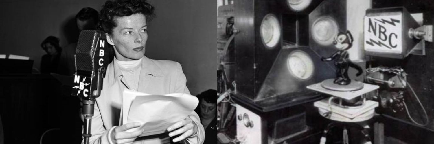
Left: Katherine Hepburn performs on NBC radio April 10, 1950, with a microphone displaying a secondary NBC logo dating from the late 1920s.
Right: Experimental television station W2XBS New York airs early broadcast tests in 1928 featuring a rotating Felix the Cat and one of several logo variants then in use.
1926: The spirit of radio
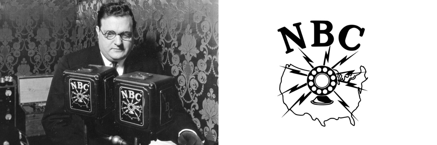
As the first permanent nationwide radio network, NBC faced the challenge of any first-time innovator leading a new industry – it needed to explain both the new technology and the growing reach of its network to listeners unfamiliar with either.
The original 1926 NBC logo shows the network introducing itself to a world where both radio and mass media were revolutionary new concepts. Listeners required some explanation. The logo depicts a radio speaker covering a map of the United States, alluding to NBC's nationwide coverage. Lightning bolts adopted from the logo of NBC's parent company at the time, RCA, radiate from the speaker like sound waves, underscoring the novelty of electronic communications.
An animation of the NBC logo through the years
The NBC television era
NBC's parent company in that era, RCA, began experimental television broadcasts as early as 1928, decades before TV became widespread. David Sarnoff introduced all-electronic television to the public at the 1939 New York World's Fair, where President Franklin D. Roosevelt became the first president to appear on television on April 30, 1939 – a broadcast seen by roughly 1000 New Yorkers within the limited broadcast range, but television's time was coming. The new medium required new imagery, and NBC's logo designers set to work.
1943: NBC promotes TV adoption
The 1943 NBC logo captures a transition moment as television began to rival the influence of radio. The familiar RCA lightning bolts are here accompanied by sound and/or light waves – a nod to television. Because television was so new, it had no iconography familiar to viewers, and so the microphone remained a key symbol for all broadcasting.
The American map was removed, as savvier audiences no longer needed a primer on mass media.
1954: the NBC "Chimes" logo
By the early 1950s, black and white television sets were flying off the shelves with tens of millions of models sold. Mass adoption of the new medium required NBC to adopt new more impactful branding strategies. The result was this logo based on the famous chimes that had accompanied most NBC broadcasts since 1926.
The three tones or chimes identifying NBC had been part of the network's since its launch. The red, green, and blue colors of the logo were chosen to represent the RGB palette used in color television.
Fun fact about the NBC Chimes: in 1946, the G-E-C notes of the NBC chimes became the first-ever "sound mark," a service mark based purely on audio elements, to be registered with the U.S. Patent Office.
1956: "The following program is brought to you in living color"
NBC began the first compatible color broadcasts in 1953, preceding other networks by nine years. Widespread adoption of color TVs would take another decade, but already in 1956, NBC was looking for ways to entice viewers to make the switch. Enter the Peacock. A brainchild of NBC art director John J. Graham and Herb Lubalin of the design firm Sudler & Hennessey, the original peacock with its 11 brightly colored plumes became NBC's foremost emblem for the color era.
While the Peacock became widely recognized and affiliated with NBC, it was never used as a network logo, appearing only at the start of color broadcasts on NBC-produced programming such as The Tonight Show Starring Johnny Carson.
On-air, the peacock logo animated to a musical crescendo as announcer Ben Grauer told viewers "The following program is brought to you in living color on NBC."
1959: The year of the "snake" logo
Another iconic design by John J. Graham, this animated ligature logo became the network's primary mark in 1959. The "snake" was a modern, video-friendly channel ID reflecting the clean midcentury aesthetics of the time, and this was the network's primary brand mark, not the peacock.
![]()
1976: the red, white, and new
In the centennial year of 1976, NBC sought to modernize and unify its brand identity across all divisions. Retaining brand consultants Lippincott & Margulies, the network aligned itself with the patriotic moment with this red and blue geometric logo.
Viewers, however, found the new look a departure from the established NBC brand, and instead they preferred an icon NBC never intended to serve as a brand.
The "Proud N" logo developed by NBC creative directors Gene Kolomatsky and Ted Szumila in 1979
1979: the Peacock gets a promotion
Fans preferred the bird. In 1977, Peter H. Kliegman from NBC's corporate planning department found through research that the "in living color" icon had become an enduring symbol of the network, and his team recommended its use as a logo.
Surprising even network executives, an emblem created to promote color television had become closely associated with NBC as a whole, and even television industry trade publications had long referred to NBC as "the bird network."
With "the Proud N," the peacock saw its first-ever use as a brand identifier.
![]()
The six-color peacock logo designed by Steff Geissbühler in 1986.
1986: the Peacock turns to face the future
Forty years ago, as part of its 60th anniversary celebrations, NBC first unveiled the modernized Peacock logo familiar to today's audiences.
By the mid 1980s, the television landscape had become crowded and highly competitive, and networks felt pressured to maintain brand distinction. Cable channels were competing with the big four networks for viewer attention, creating a need for stronger, simpler brand recognition. NBC's solution was to turn to leading-edge professional branding firm Chermayeff & Geismar.
Renowned designer Steff Geissbühler simplified the Peacock logo into a minimalist masterpiece – the entire logo comprises just six colored plumes with a single notch in the violet plume to indicate the peacock's beak. The six plumes represented the six business divisions of NBC at the time: NBC News (Yellow), NBC Sports (Orange), NBC Entertainment (Red), NBC Television Stations (Purple), NBC Network (Blue), and NBC Productions (Green).
One subtle but important change Geissbühler made: the peacock now faces right, reinforcing NBC's reputation for looking toward the future – and helping define it.
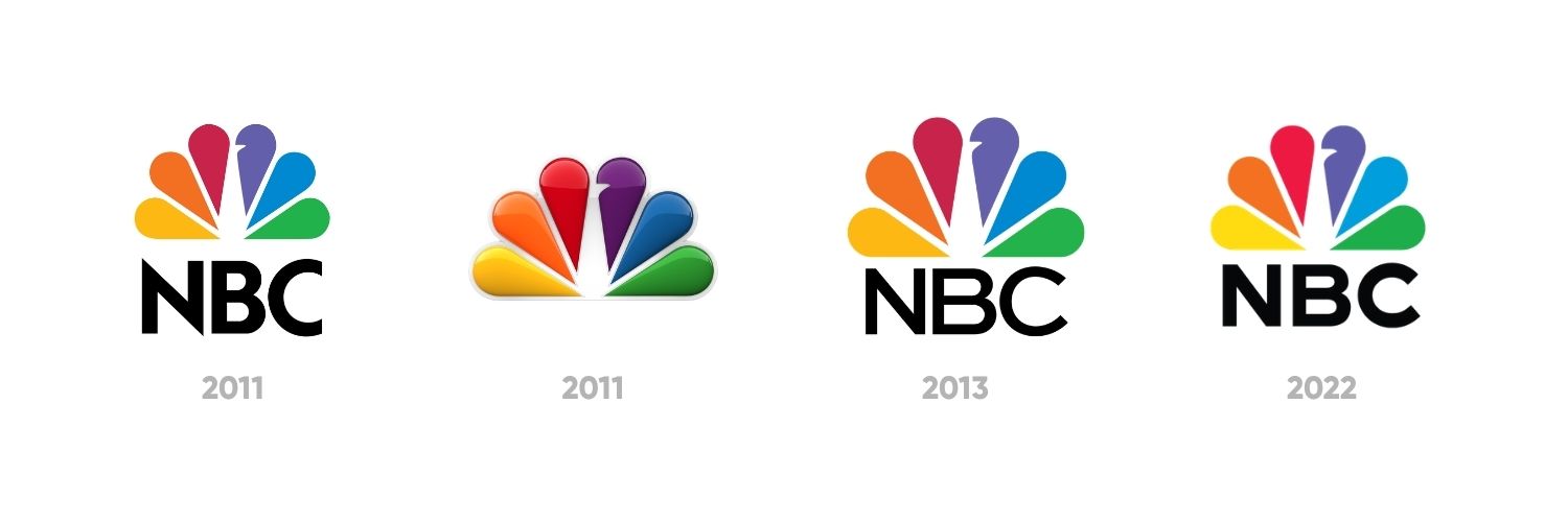
1986-2022: Peacock logo variations
While the essential design remains unchanged, the peacock icon and the NBC logotypes have undergone several adjustments and variations over the past four decades.
- The 2011 NBC logo featured slightly wider spaces between the plumes to enhance legibility in smaller and digital formats, and a wordmark set in NBC Futura.
- A dimensional logo variant from 2011 brought depth and texture to the logo.
- This logo update from 2013 featured a new wordmark set in Sweet Sans Pro, replacing the in-house typeface, NBC Futura. In 2018, the wordmark would be updated to another in-house typeface, NBC Tinker named in honor of the former chairman.
- The current NBC logo, adopted in 2022, features a heavier weight of NBC Tinker and the Peacock's beak is slightly larger to improve legibility in smaller formats.
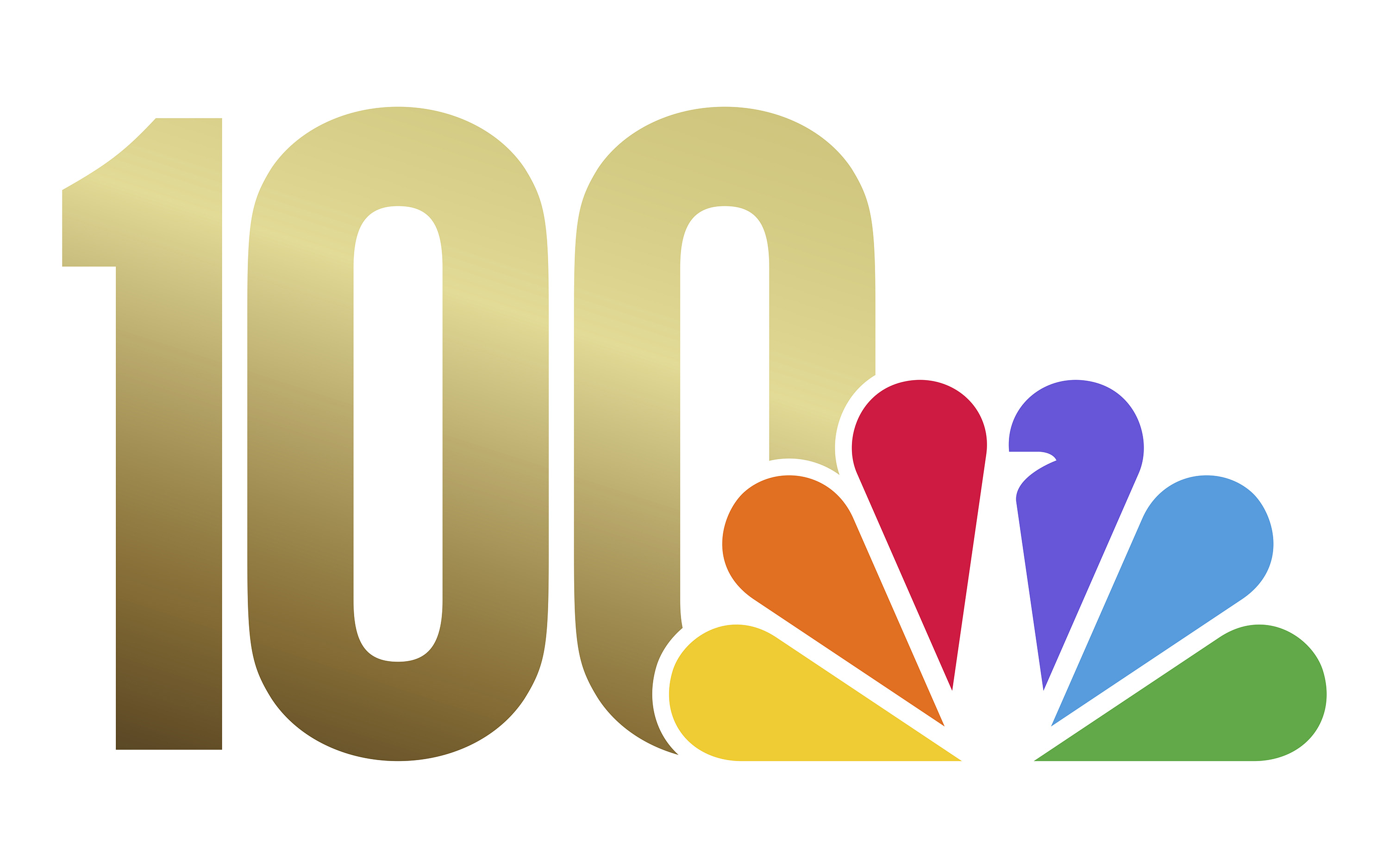
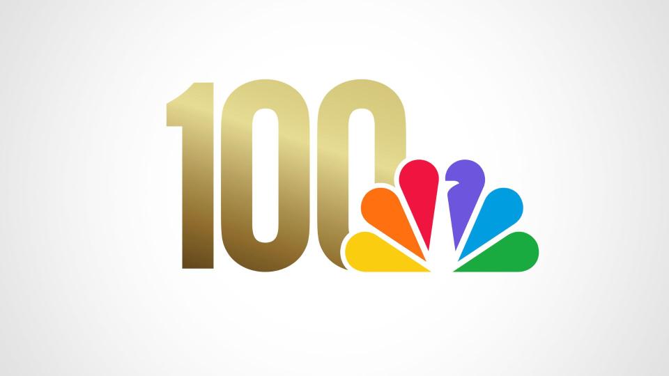
A logo designed to celebrate NBC's first 100 years.
2026: NBC turns 100
This year as NBC celebrates 100 years of innovation, it looks back at a century defined by groundbreaking firsts, new technologies, and creative output that continues to shape the modern world. As important as it is to honor the past, NBC has built a lasting reputation by looking toward the future. As NBC looks ahead to its next century, its logo will continue to evolve alongside the innovations and definitive moments that will shape the network in years to come.